MY PROCESS
I start out by asking what the product needs to be, moreover, how the function of the product will work. I have learned that I am a list maker. When starting on concepts for projects I produce copious amounts of lists that lead me closer to where I believe the piece needs to be headed. When the lists have been worked to exhaustion and I have a good feeling for what the project will become, I research. The deep dive into research enables the functionality of the project to remain strong throughout the creation process that follows. The research that I did for my personal branding included thought exercises, adjective listings, and some Pinterest searching.
The left page shows how I started to think about my personal logo. The page also shows a thought exercise I used to try and explore myself further.
As someone who not only enjoys design but also printmaking and photography, I have always found joy in the process of a project. I enjoy working many different variations of the design to find the one that will inevitably become the final. I believe the love of process comes from the printmaking part of me, the part that revels in woodblock carving, etching, and screen printing.
The next four images, shown below, are a great example of the different variations of my initials I worked with while trying to find the perfect logo. Personally I was drawn to the initials being what represented me but a personal logo does not only or always have to be based on initials. Click into the group to get a closer look at the letterforms!
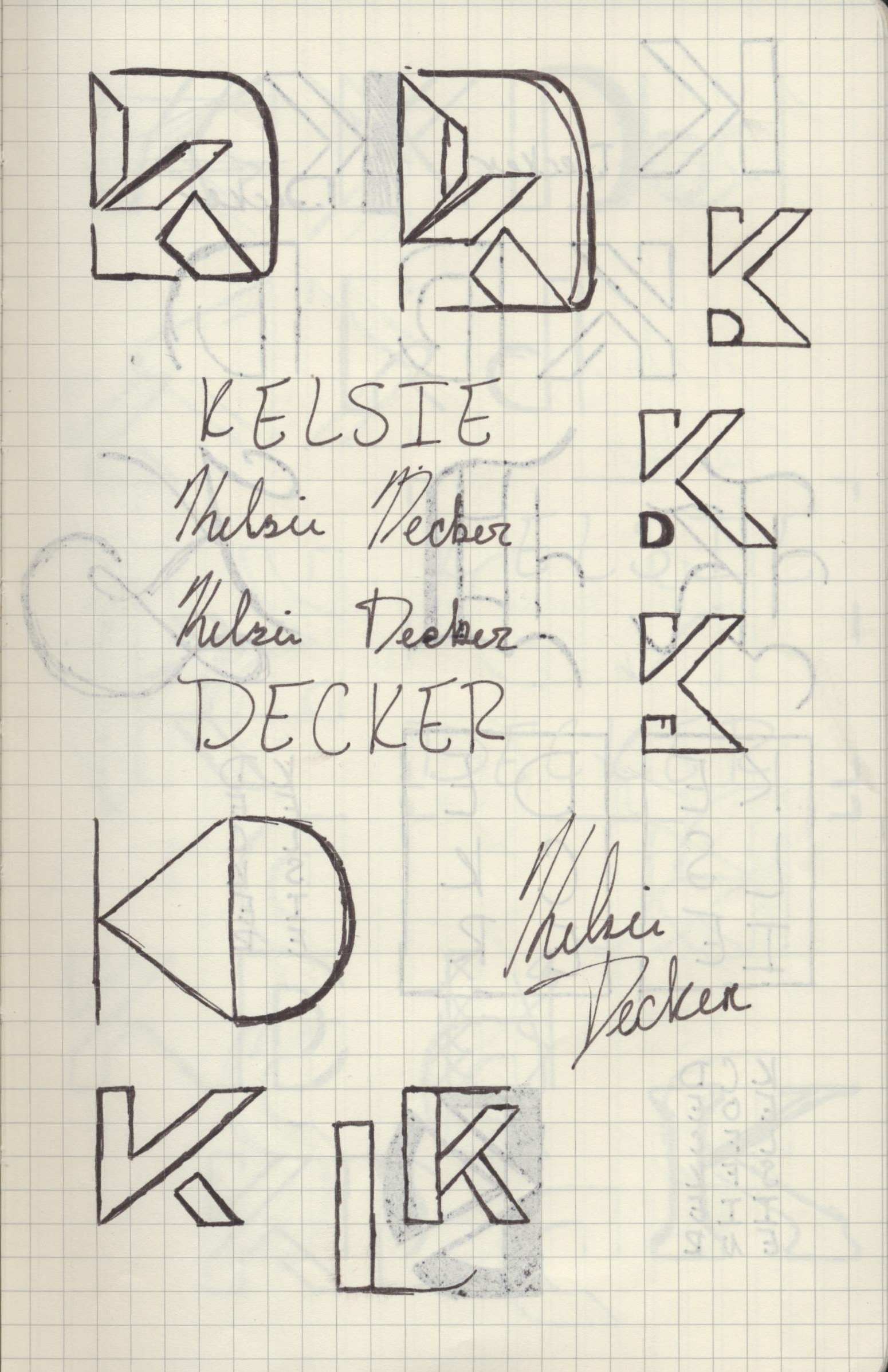
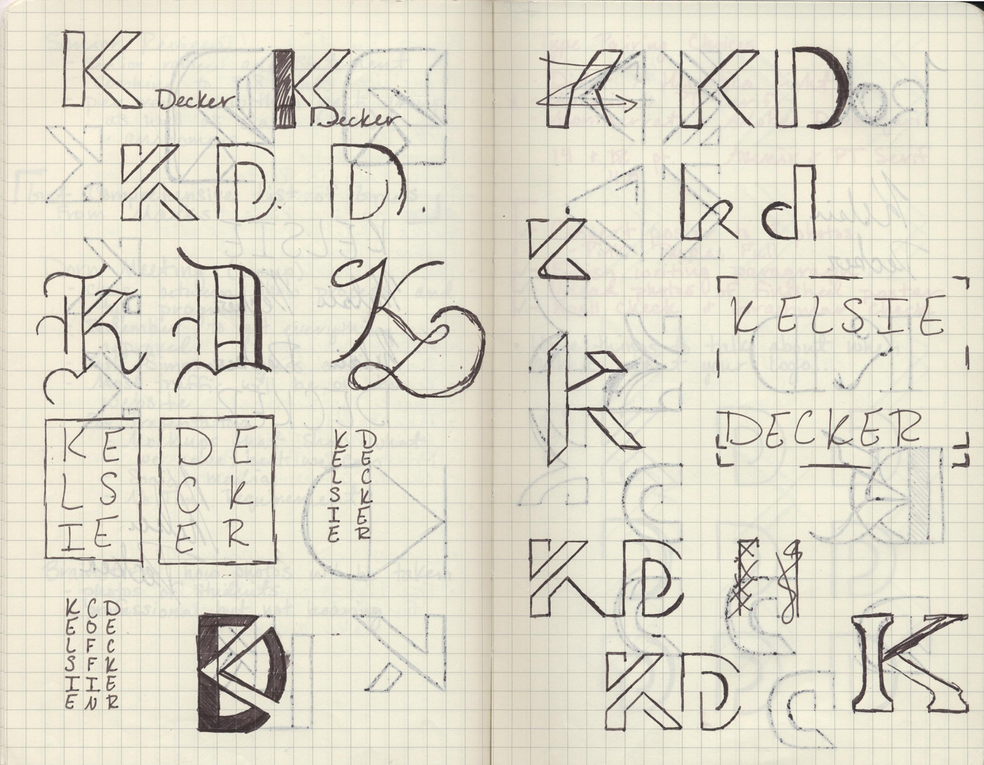
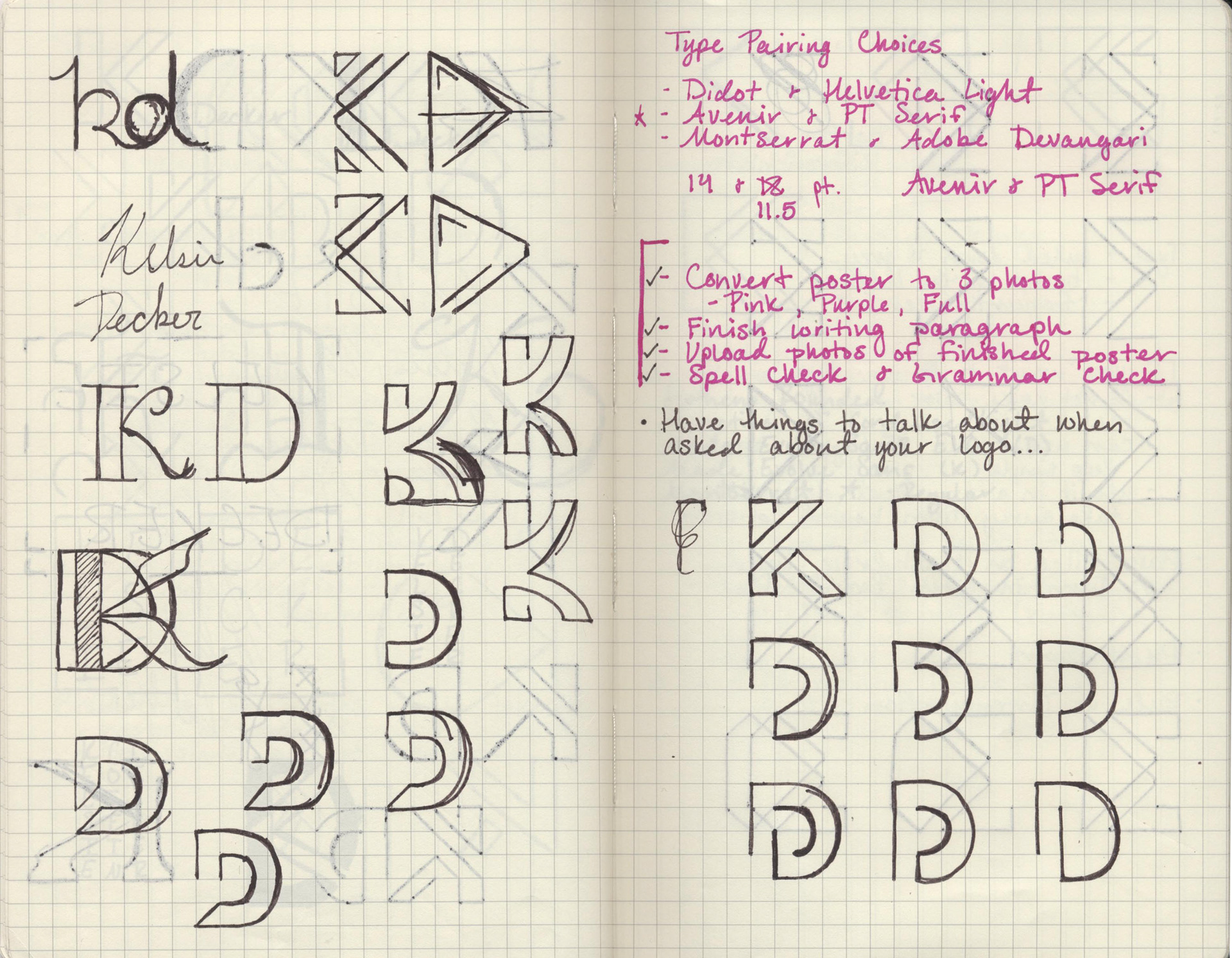
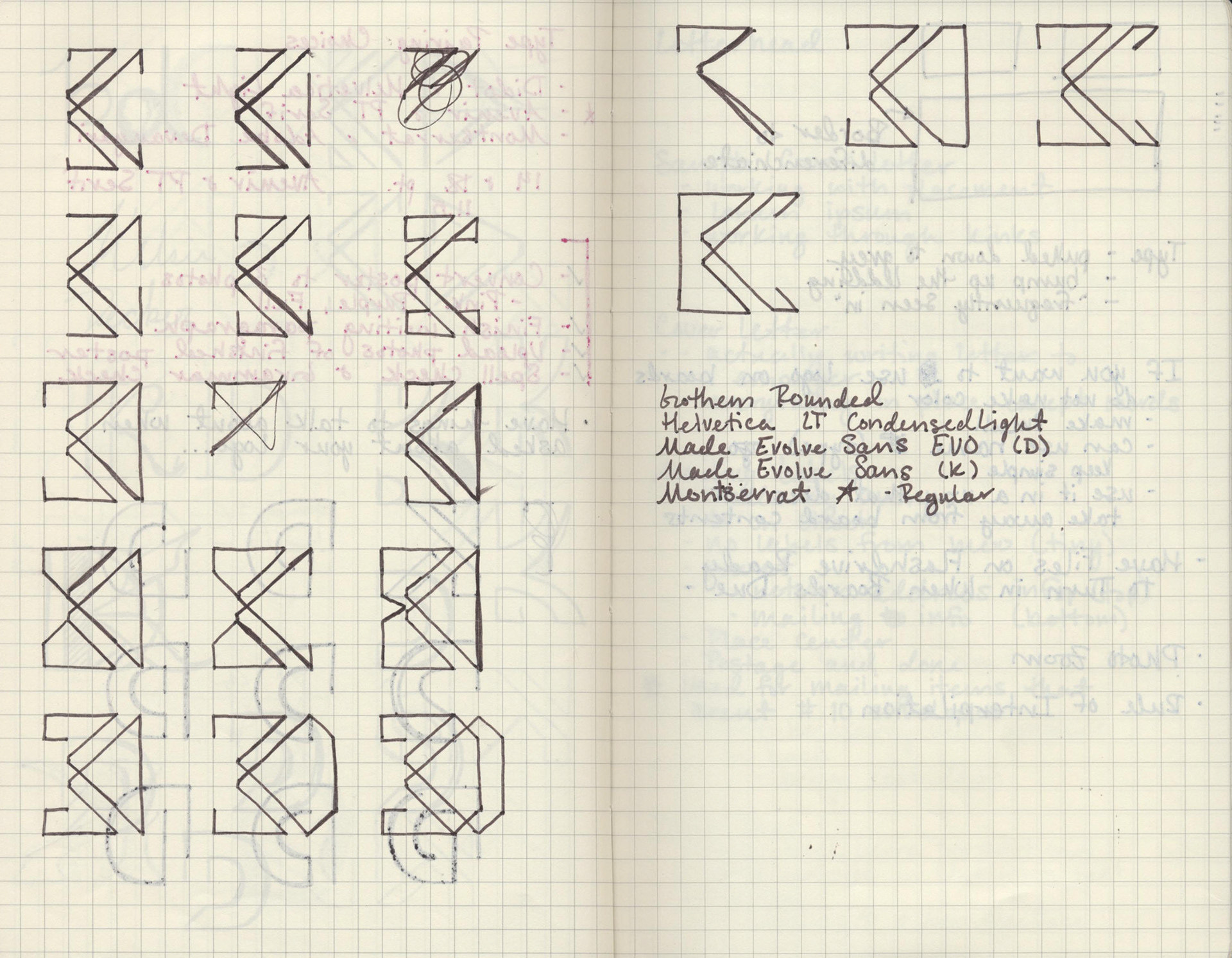
After I have settled on a design I believe will become the final product, I move to the computer and look at color, size, type, and anything else the logo/brand may need.
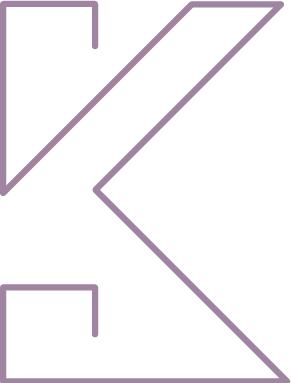
For my personal branding I decided to go with a simple, single line stroke, capital K. I paired the logo with the typeface Monserrat Regular then moved forward to creating horizontal and vertical lockups. While creating the logo I always referred back to that first list made for what the feeling of the logo should be. I softened the points of the lines in order to make the logo more approachable and chose colors that I thought expressed who I am as a person.
